Last time:
I introduced some of the top tips I learned working as an information architect in Silicon Alley.
My top 3 tips had to do with what to teach.
Tip #1 from the Web: Who is your audience?
Tip #2 from the Web: Less is More
Tip #3 from the Web: Categorize
These tips are still not enough to ensure that students will get what we want from a lesson. Teachers need to also worry about how their presentations look.
I wasn’t hired to be graphic designer, why worry so much about how to present information?
Have you ever spent hours preparing a shiur, and then, at the last minute, given out a list of sources copied straight from the Bar Ilan CD-Rom? As the students scan the sheet, their eyes glaze over, and you spend the rest of your time trying to get them re-engaged in your carefully planned lesson.
When we don’t think about how we present our information visually, we end up trying to entertain our students to hold their attention. With a little tweaking of how our worksheets and lessons look, we can make learning and teaching much easier and more fun.
Tip #4 from the Web – Use both Pictures and Words!
People learn from text and they learn from pictures. They learn from each using different parts of the brain. When both pictures and words are used at the same time, learning time is cut in half!
On the web, this has led to an explosion of graphics and icons.As teachers, we should not underestimate the power of the graphic to explain information.
- Illustrate a pasuk on the board rather than just using words.
- Draw the translation of a shoresh.
- Think of icons to represent abstract concepts.
- Use graphic organizers.
Using all the tools available helps every student learn.
Tip #5 from the Web – Write Visually

This list, taken from usability.gov, can help teachers create innovative materials that help students learn.
On the web (and hopefully in your class)
- Information is bulleted or numbered
- Sentences are short.
- Paragraphs are short. Only 2-3 sentences long. At the most.
-
There are tables to organize information - There are headings and subheadings
- The fonts for headings are bigger and different than the fonts for the information text.
- Important words are bolded or italicized
- Color is used to indicate meaning
- There are lots of pictures and diagrams.
- There is space between paragraphs to help chunk the information
Try these techniques out on your board and your handouts. You will find that using one or two of these suggestions really transforms your boring handouts to make them look engaging and professional.
Tip #6 from the Web – Make it personal.
 |
| http://www.flickr.com/photos/asam/ |
People are drawn to faces. People like social interactions. Websites are full of faces because it engages us and keeps us on a website longer.
Using real pictures of your students is a very cheap way to get them motivated.
Tip #7 from the Web – Perception is king

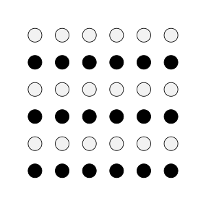
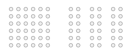
In this example, by putting space between sets of circles, your mind now sees 3 columns instead of the square.

Tip #8 from the Web – Provide a Map
- where they are,
- how they got there,
- and where they are going.
When we teach, we must provide maps of where information belongs. Otherwise, students will get frustrated and may never give us another chance to reach them.
How do we provide navigation for students? On websites, every page has a header and a section. Similarly, all of our papers need to be labeled so students clearly see where they belong. Every page should include page numbers, a title, and it’s category – such as notes, quiz, worksheet etc.
Navigation also applies to how the lesson unfolds. We need to have a clear progression in our lessons so students understand how the lesson was developed so that they can recreate the logic independently.
Summing up:
What to include
3. Have I categorized information when possible?
How to include it
5. Did I write briefly and visually?
6. Is it personal? Can I include photographs to make it more meaningful?
7. Is it organized using headings and principles of proximity and similarity (color, size, shape)
8. Have I provided context and a way to navigate the information independently?


